

Why This Photo Works: 5 Elements of Moody Landscape Photography
Every day, millions of people stand in front of a stunning view, point their phone at it, and take a picture. And most of those pictures are, to put it kindly, as flat and forgettable as a day-old croissant. They capture the what but completely miss the why.
A good landscape photograph doesn’t just show you a place. It makes you feel the place. It tells a story. It has a mood.
So, let's take a look at this atmospheric shot of a solitary lighthouse. It’s more than just a picture of a coastline. It has weight and emotion. Today, we’re pouring a strong one and breaking down the five key elements that make it work.

It’s not just a lighthouse. It’s a feeling. Let’s explore why.
1. Asymmetrical Balance: Finding Harmony in Unease
The first thing you might notice is that the image isn't symmetrical. And thank goodness for that. Symmetry can be peaceful, but it can also be dreadfully boring. This photo uses asymmetrical balance to create tension and interest.
Asymmetrical Balance in composition is achieved when the visual weight of elements on either side of a central axis is unequal but still feels balanced. This is often done by balancing a large, simple area against a smaller, more complex one.

The heavy, dark landmass below is balanced by the light, open sea and sky above.
You have the heavy, dark, textured landmass in the bottom half, creating a strong visual anchor. This is balanced by the light, airy, and relatively empty expanse of the sea and sky in the top half. The composition plays the weight of the earth against the openness of the water, which feels far more natural and dynamic.
2. The Guideline of Thirds: A Deliberate Imbalance
You know how I feel about rules. But the guideline of thirds is a classic for a reason. It’s the salt in your cooking—a simple addition that elevates everything.
The Guideline of Thirds suggests placing key elements along lines that divide the frame into thirds, both horizontally and vertically. Placing the horizon on a third, rather than in the centre, often creates a more compelling image.
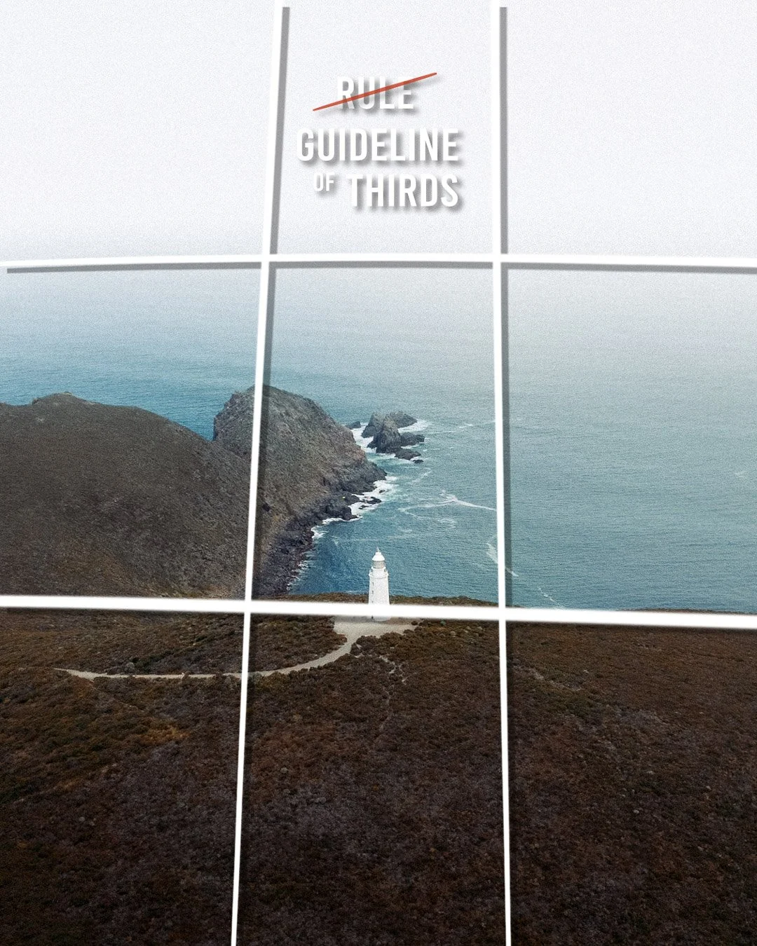
he horizon sits on the lower third, giving the moody sky and sea the space they deserve.
Instead of plonking the horizon line in the dead centre, it’s placed on the lower horizontal third. This gives the vast, moody sea and sky two-thirds of the photo to dominate, emphasising the feeling of openness and isolation. Our tiny hero, the lighthouse, sits perfectly near an intersection. This placement feels deliberate and deeply satisfying to the human eye.
3. Negative Space: The Soul of Solitude
Now for one of the most important, and most overlooked, elements in art: nothing. The empty bits. In photography, we call this negative space.
Negative Space refers to the area surrounding the main subject in a photograph. Far from being empty, this space is an active compositional element that helps define the subject and can create a specific atmosphere, such as minimalism, isolation, or grandeur.
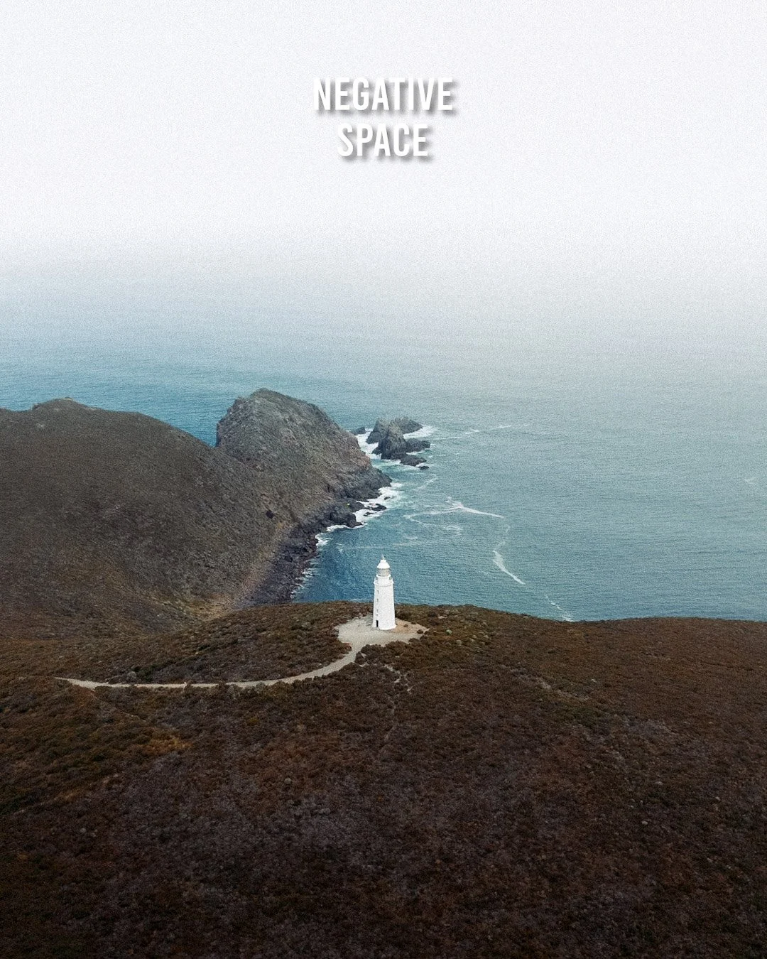
The "empty" sea and sky are active characters, creating a profound sense of scale.
The vast sea and the pale, overcast sky aren't just background fluff; they are active elements. This emptiness frames the land and lighthouse, pushing our attention onto them and making them seem small and vulnerable against the immense power of nature. Think of it like music. The silence between the notes is just as important as the notes themselves.
4. Colour Harmony: Painting the Mood
The colours in this photo are doing some serious work. There are no vibrant, screaming hues here. We're dealing with a limited and cohesive palette, a concept known as colour harmony.
Colour Harmony is the use of a limited, related colour palette to create a unified and aesthetically pleasing mood. Muted, analogous colour schemes (colours adjacent on the colour wheel) are often used to create a sense of calm or melancholy.
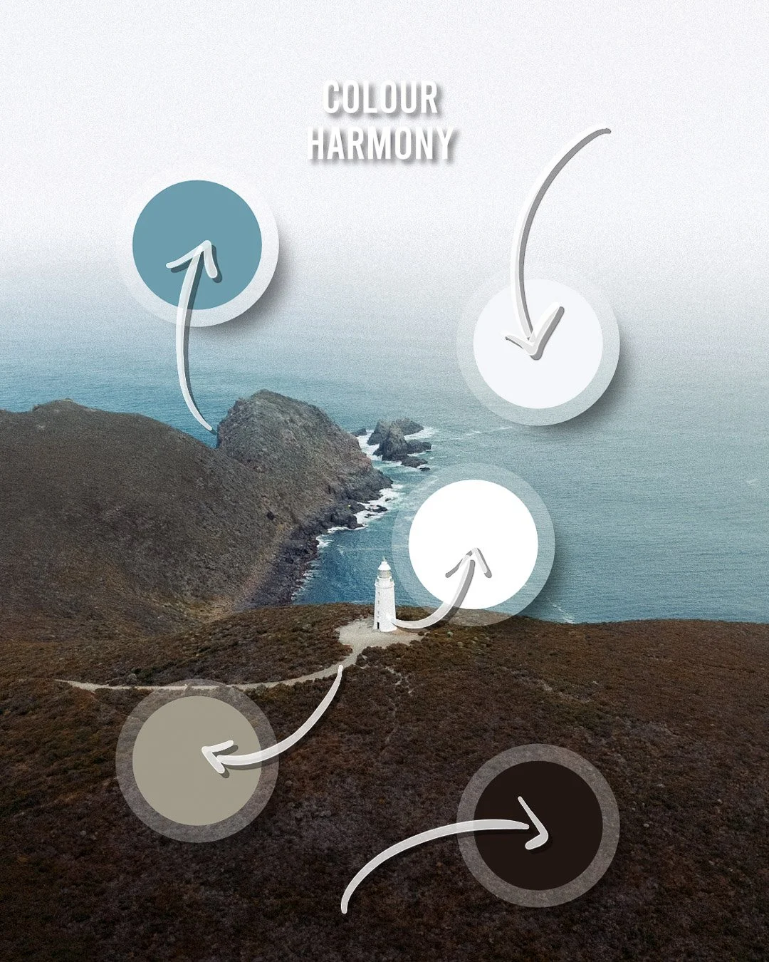
A limited palette of muted blues, browns, and whites is the source of the photo's moody atmosphere.
We have the deep, earthy browns of the land, the muted teals of the sea, and the soft whites of the sky and the lighthouse. These colours work together beautifully. They don't fight for attention. This limited palette is the primary reason the photo feels like a crisp, overcast day on the coast.
5. Narrative: The Secret Ingredient is a Question
This is the part that separates a good photo from a great one. A great photo has a narrative. It asks more questions than it answers.
Narrative in photography is the implied story or concept within an image. It is conveyed through the combination of subject, setting, and mood, and it invites the viewer to imagine the events that might have happened before, during, or after the moment was captured.

A great photo doesn't give you answers; it makes you ask questions.
Look at the frame and think about the story. Who lives in that lonely lighthouse? Where does that path lead? What storms are coming? The photo gives us elements—solitude, peace, an endless void of water—but it doesn't give us the whole story. It invites you, the viewer, to fill in the blanks. That's incredibly powerful. It makes the image stick in your mind long after you've scrolled past it.
The Barista's Notes: A Summary
This isn't just a picture of a lighthouse. It’s a carefully constructed feeling.
Asymmetrical Balance: Creates a dynamic but stable foundation.
Guideline of Thirds: Places the elements where they feel most impactful.
Negative Space: Gives the image scale and a soul-stirring sense of solitude.
Colour Harmony: Sets the moody, melancholic tone.
Narrative: Invites the viewer into the story, making the image unforgettable.
It’s proof that the best landscape photography isn’t about showing what a place looks like, but about capturing what it feels like. So, what story will your next photo tell?
Right, you've made it to the end. You're probably wondering who the caffeine-fuelled bloke dissecting photos is. I'm Christo Brits.
When I’m not writing these breakdowns over a dangerously strong flat white, I run my business, CB Photography. I'm a brand photographer based in Australia, and I use every single one of these principles—story, contrast, balance—to help businesses create images that don't look like they were pulled from a stock photo catalogue from 2004.
P.S. Want the shortcut to my editing style? If you dig the moody, clean look of the photos on this blog, I've packaged my entire editing process into Lightroom Presets. They're the quickest way to get a professional look without the years of tweaking sliders until your eyes bleed. You can grab my presets right here.