

5 Composition Tricks That Make This Simple Photo Work
So, you’ve taken a photo. Brilliant. You point your fancy camera-phone thingy at something, the little box on the screen goes green, and you press the button. Job done. You’re practically Ansel Adams, right?
Wrong. So deeply, painfully wrong.
Most of the time, that approach gives you a photo that’s about as inspiring as lukewarm, instant coffee. It’s technically a thing, but nobody’s happy about it. But every now and then, you capture something that just… works. You might not even know why. It just feels right.
This is one of those photos. And today, fuelled by a dangerously strong brew, I’m going to break down the five key ingredients that make it work. Because unlike your cousin’s holiday snaps, this wasn’t an accident.
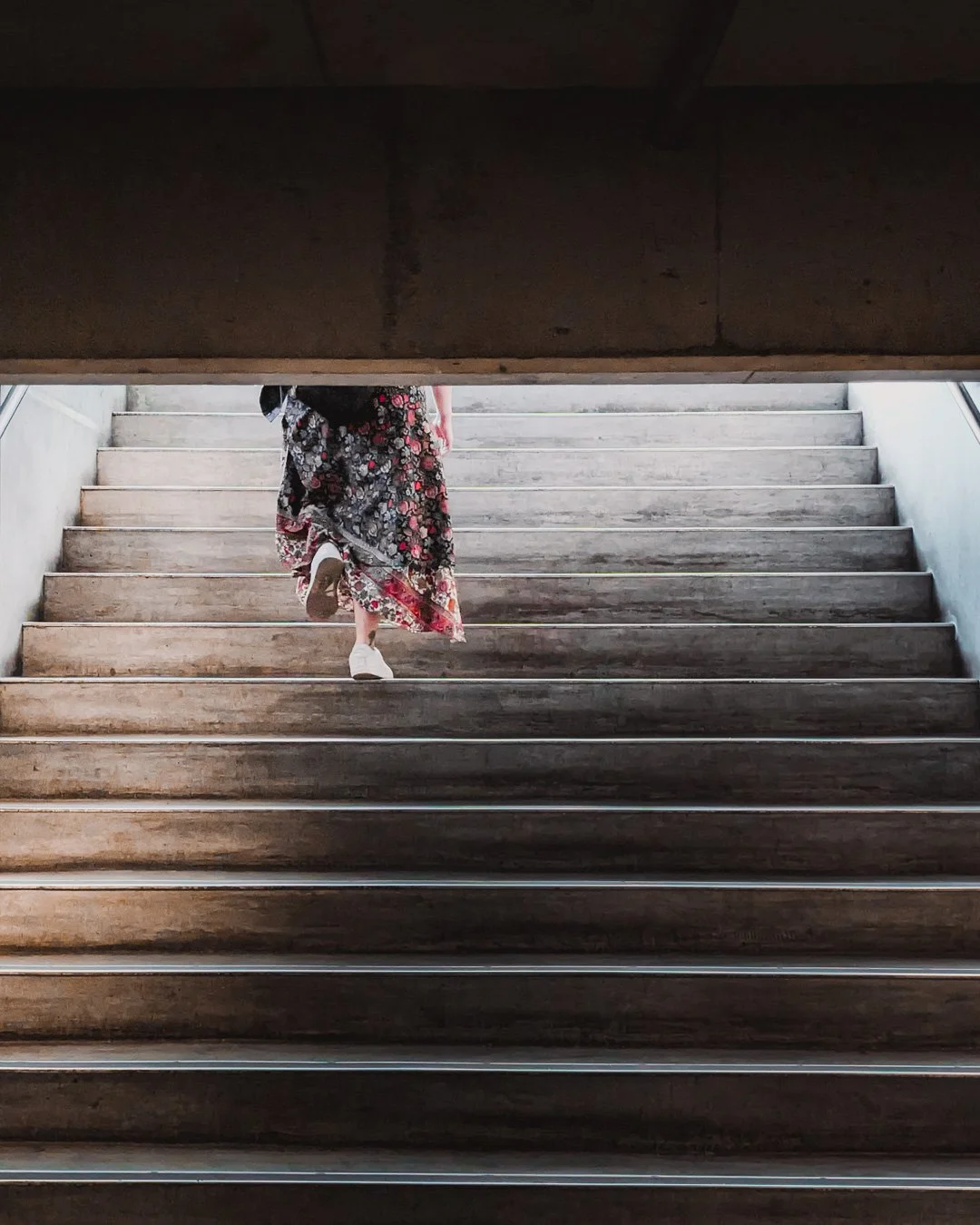
The subject of today's dissection. Let's get to it.
1. Leading Lines: The Unavoidable Path
Your eye isn’t just wandering around this image aimlessly, is it? No. The moment you look at it, the strong, repetitive lines of the stairs grab your vision and drag it upwards.
Leading Lines are lines within an image that the viewer's eyes naturally follow. They are used to draw attention to a specific point of interest, create a sense of depth, and guide the narrative of the photograph.

These lines are the visual equivalent of a big neon sign pointing directly at our subject.
These lines create a powerful, unavoidable path. They are the visual equivalent of someone grabbing your hand and saying, "Oi, look over here." In this case, they all point directly towards the person walking up the stairs. You can't not look at her. It’s a simple, brutally effective way to control where your viewer looks first.
2. The Rule (or Guideline) of Thirds
I prefer to call it the "Guideline of Thirds," because I'm an artist and I don't like being told what to do. But for the sake of argument, let's cover this fundamental concept.
The Rule of Thirds is a compositional guideline that suggests an image should be imagined as divided into nine equal parts by two equally spaced horizontal lines and two equally spaced vertical lines. Important compositional elements should be placed along these lines or their intersections.

Notice how she isn't dead centre? Good. Let's keep it that way.
Look where our subject is. Not dead centre. Never dead centre. Putting your subject in the middle is like serving a single, lonely piece of biltong on a massive platter. It’s boring and lacks balance. Here, she is placed perfectly along the left vertical line, creating a much more dynamic and visually interesting image. It gives the rest of the photo room to breathe. Which brings us to...
3. Negative Space: The Power of Nothing
What is the subject of this photo? Is it the person? The stairs? The darkness? Yes.
Negative Space is the area around and between the subject(s) of an image. When used deliberately, negative space can be a powerful compositional tool to define the subject, create a specific mood, and provide a sense of scale or isolation.
The big, dark, empty area at the top and the lines of the stairs are just as important as the person walking on them. This is negative space. It’s the "nothing" in the photo that gives context and power to the "something."

All that "emptiness" isn't empty at all. It's framing the subject and telling a story.
Without that dark, oppressive block at the top, the image would feel less focused. The negative space frames the subject and adds to the mood. It tells a story of ascent, of moving from one place into another. It’s the quiet that makes the noise matter.
4. Tonal & Colour Contrast: The Art of Standing Out
Contrast is the salt and pepper of photography. A photo without it is bland and forgettable. This image uses two types.
First, Tonal Contrast, which is the difference between the light and dark areas. Here, it’s not subtle. We have bright, almost-white steps set against deep, dark shadows.

The dramatic clash between bright highlights and deep shadows gives the image its punch.
This stark difference creates drama and depth, making the image feel bold and graphic.
Then there’s Colour Contrast. The entire scene is made up of muted, monochrome tones—greys, browns, blacks. And then… BAM. That pop of floral red and pink in the subject's skirt.

Against a neutral backdrop, even a small amount of colour becomes a magnet for your eyes.
It’s not loud, but it doesn't have to be. Against the neutral background, that little bit of colour acts as a magnet for the eye, reinforcing the subject as the most important element. It's the final, perfect dusting of chocolate on the cappuccino.
The Espresso Shot: A Summary
This photo works because these elements aren't just there by chance. They are all working together, conducting a tiny visual orchestra.
Leading Lines: The stairs create a path, forcing your eye towards the subject.
Guideline of Thirds: Placing the subject off-centre creates a more dynamic balance.
Negative Space: The "empty" areas frame the subject and build a sense of mood and story.
Tonal Contrast: The difference between light and dark adds drama and depth.
Colour Contrast: A small pop of colour on a neutral background makes the subject the undeniable focal point.
It’s a recipe. Each ingredient is added deliberately to create a final product that is so much more than the sum of its parts. So go look at your own photos and ask yourself: did I just throw things in a blender, or did I follow a recipe? What's the one "rule" you always fall back on?
Right, you've made it to the end. You're probably wondering who the caffeine-fuelled bloke dissecting photos is. I'm Christo Brits.
When I’m not writing these breakdowns over a dangerously strong flat white, I run my business, CB Photography. I'm a brand photographer based in Australia, and I use every single one of these principles—story, contrast, balance—to help businesses create images that don't look like they were pulled from a stock photo catalogue from 2004.
P.S. Want the shortcut to my editing style? If you dig the moody, clean look of the photos on this blog, I've packaged my entire editing process into Lightroom Presets. They're the quickest way to get a professional look without the years of tweaking sliders until your eyes bleed. You can grab my presets right here.